
From now on, you can set custom heights for mobile devices only for your virtual tours using WPVR.
That means you can set a dimension for PCs and choose to set a completely different height when users will view the virtual tour on mobile devices.
Suppose, on any PC, the height of the virtual tour is 600px.
And on mobile devices, you can set it to show the virtual tour with 800px.
Since most of your mobile viewers will view the virtual tour in portrait mode at the first glance, it’ll give them a better view.
Let’s learn how you can apply it.
Benefits of Custom Mobile Height in WP VR Virtual Tours #
- Enhanced Mobile User Experience: Taller height in portrait mode makes panoramas more engaging from the first glance.
- Improved Engagement & SEO: Better mobile optimization reduces bounce rates, increases time on page, and supports Google’s mobile-first indexing.
- Flexible Responsive Design: Maintain ideal proportions on desktops while adapting perfectly to phones.
- Easy Integration: Works seamlessly with Gutenberg, shortcodes, Elementor, and other builders.
Let’s learn how you can apply this powerful feature.
Set Custom Height for Mobile Devices to Your Virtual Tours – Using WPVR Gutenberg Block #
Once you have created a virtual tour, follow these simple steps:
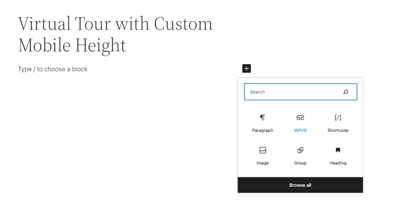
i. Using Gutenberg, choose the WPVR Gutenberg block.
ii. Here, you’ll find options to set the ID of your tour, regular height, width, and radius for all devices.
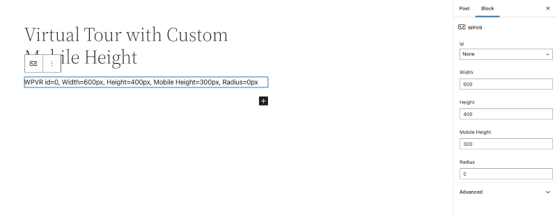
iii. Along with these, you’ll find an option to set the mobile height.
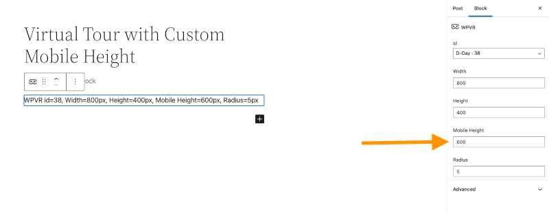
Here, you can set a different height than the regular height.
And it’ll be only applied on mobile devices.
However, if you don’t want to set a custom mobile height, you can just keep it blank.
As you can see, it was really easy to set custom height for mobile devices for your virtual tour.
With WPVR, you can also set dynamic front end notices to your virtual tour, only for mobile devices.
Pro Tips for Perfect Mobile Virtual Tours in WP VR #
- Recommended Heights: Start with 600-700px for desktop and 800-1000px for mobile (adjust based on your content).
- Combine Features: Enable the dynamic front-end notice for mobile visitors (WP VR > Settings) with messages like “Tap fullscreen for the best view!” to guide users further.
- Performance Boost: WP VR automatically optimizes panorama images – pair with a caching plugin for lightning-fast mobile loading.
- Works Everywhere: This mobile height setting also applies when using shortcodes, Elementor widgets, or other page builders (via the block’s shortcode output).
WP VR by RexTheme continues to make mobile optimization simple, helping you create professional 360° virtual tours that look amazing on every screen.
Ready to enhance your tours? Update WP VR to the latest version and try this feature today!
For more mobile optimization guides: