
With WP VR, you can use custom navigation and control buttons to make the virtual tour more attractive.
Here is how you can do it.
Setting Up Custom Control Buttons #
When editing a tour, normally, you can use the Show Controls option.
Click on the “Preview” button. It will display the simple control buttons – Zoom in, Zoom out, and Fullscreen.

However, you can rather use custom icons to place navigation and control buttons on your tour to make it more attractive.
**Enabling custom control buttons will disable the Show controls option and rather use the custom icons you assign.
How to Customize the Control Buttons Icons #
Simply follow the steps below.
1. While editing a tour, go to the Basic Settings tab.
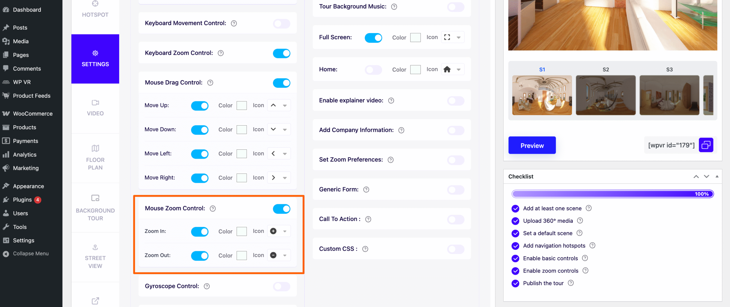
2. Next, on top, click on the Advanced Controls tab. Here, you will find the options to enable custom icons for navigation and control buttons. Now enable Mouse Drag Control
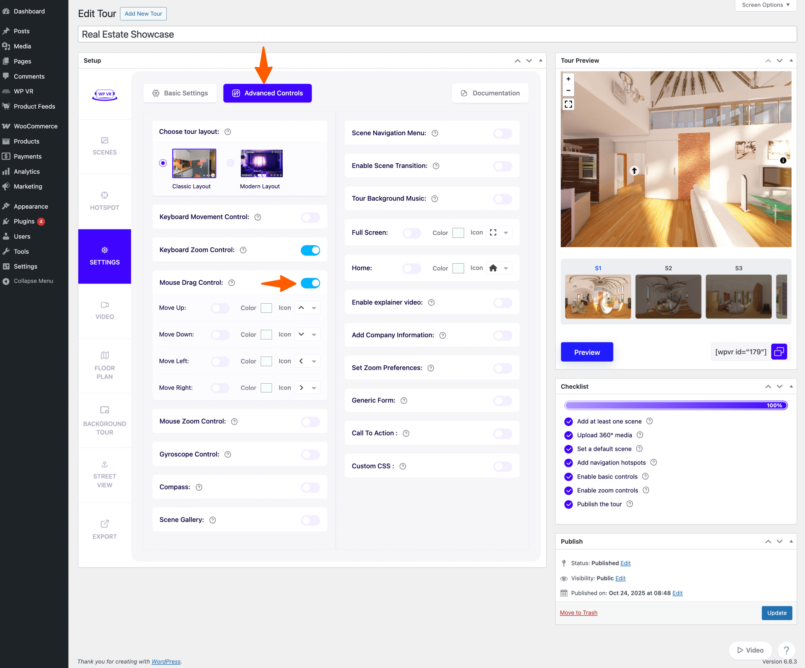
3. Here, you will be able to choose your desired icons and color for the navigation and control buttons.
You will be able to use custom icons for the following:
- Move Up
- Move Down
- Move Left
- Move Right
- Zoom Out
- Full Screen
- Gyroscope
- Home
4. Enable any of the four Movement options, or the Full-screen option to add a custom navigation pane on your tour on the bottom left side.

It will look something like this, depending on the icons and colors you choose.
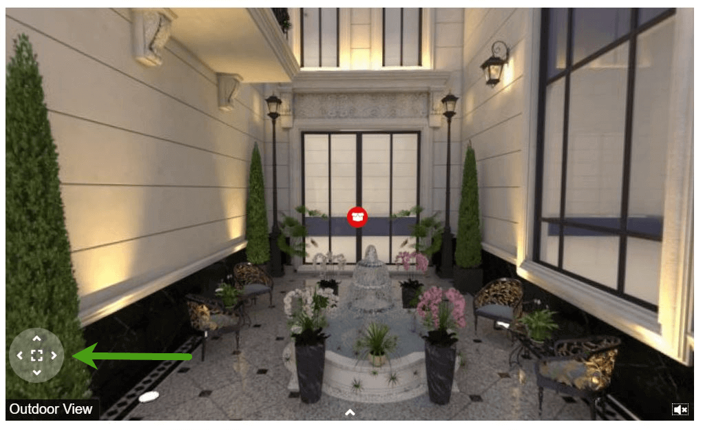
5. Enable the Mouse Zoom Control options to add the zoom in and out icons on the top left side of the tour.
Changing Custom Icons And Color Of The Control Buttons #
For each option under the Advanced Controls, you can change the icon and color for the Classic Layout.
1. Changing icon:
For each option, you can click on the icon (as shown in the image below) to choose from several other Fontawesome icons.
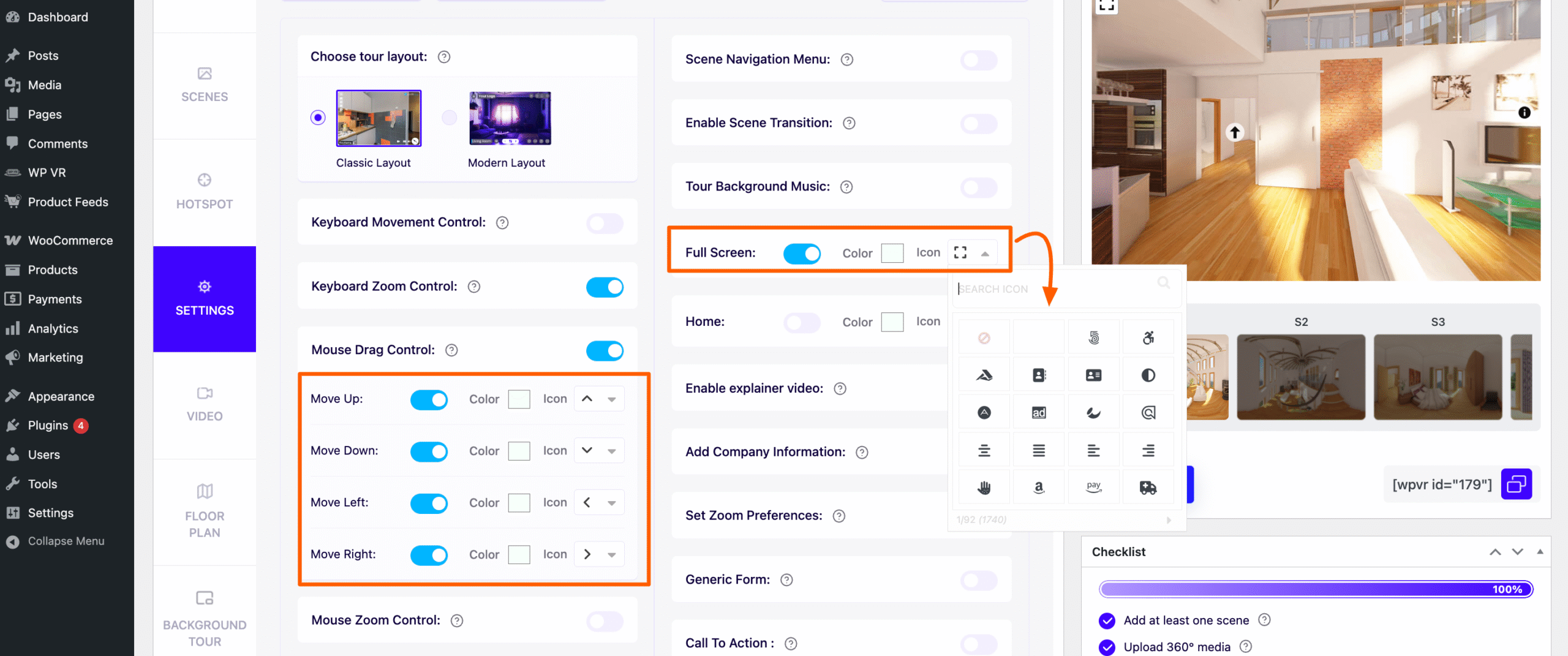
2. Changing color:
For each option, you can click on the color box (as shown in the image below) to choose your desired color for the icon.

Here’s how a tour looks with custom navigation and control buttons:

How The Control Buttons Work On A Tour #
- Move Up: Clicking on it will move the view upwards on the tour.
- Move Down: Clicking on it will move the view downwards on the tour.
- Move Left: Clicking on it will move the view towards the left on the tour.
- Move Right: Clicking on it will move the view towards the left on the tour.
- Zoom In: Clicking on it will zoom in the view on the tour.
- Zoom Out: Clicking on it will zoom out the view on the tour.
- Fullscreen: Clicking on it will toggle the tour to be viewed on fullscreen mode.
- Gyroscope: The Gyroscope button will only work when the tour is displayed using a mobile device and the Gyroscope option is enabled (see docs). Clicking on it will enable/disable the Gyroscope mode on the tour.
- Home: Clicking on it will take the visitor back to the default scene (or first scene) of the tour.
**If you only want some of these icons to appear but not all, then simply enable those and keep the rest disabled.
That’s it. That’s how you can easily use custom icons for navigation and control buttons in your virtual tour.