In the last couple of lessons, you learned how you can add hotspots and use them properly.
In this WP VR lesson, you will learn how you can customize hotspot icons and colors.
Using Custom Hotspot Icons From Plugin #
While creating a hotspot, on the left side, you will see three fields called
- Hotspot Custom Icoon
- Hotspot Custom Icon Color
- Hotspot Animation

These allow you to use custom icons provided by WP VR for your hotspots.
Follow these steps below to use these custom icons properly.
1. Click on the option under Hotspot Custom Icon.
2. Here you will be able to choose from over 900+ Fontawesome icons that you can use as the hotspot icons.

3. Next, click on the option below Hotspot Custom Background Color and Hotspot Custom Icon Color to assign the color you want your hotspots to have.

4. On Hotspot Animation, by default, it is turned on. This will give a continuous ripple animation on the hotspot to be more noticeable. You can turn it off if you don’t want any animation for the custom icons.
5. You can also change the Hotspot Shape by choosing the options from the dropdown.
Hotspot Shapes:
- Rounded
- Square
- Hexagon
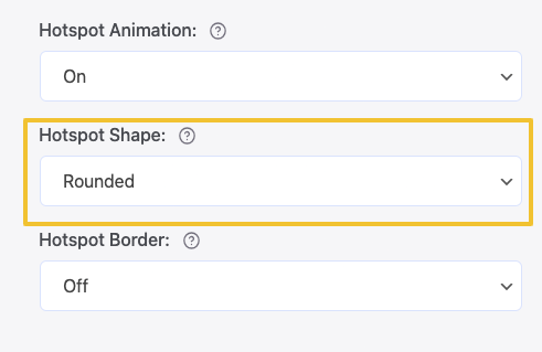
6. You can also customize the Hotspot Border. By default, it is off. Once you turn it on you’ll see the options to customize it.

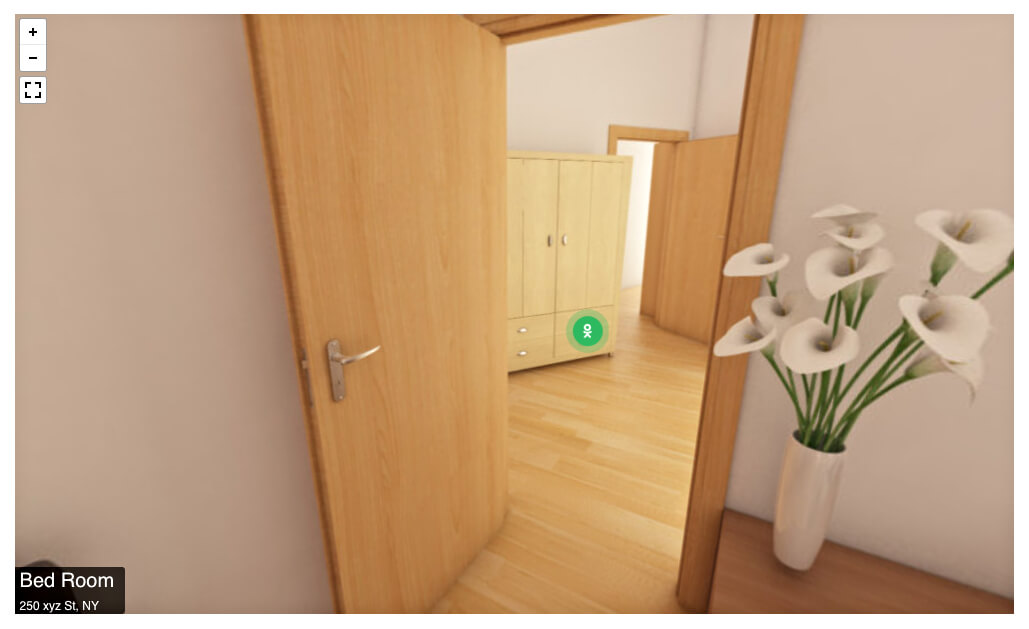
7. Now, these are custom icons and cannot be viewed on the tour preview. So, publish the tour and embed it on a page/post. Then preview the page/post and you will be able to see how it looks.
**These customizations are based on each hotspot. So if you want to customize a second hotspot, you need to select that hotspot and then use these customizations.
That’s it. That’s how you can customize hotspot icons and colors.